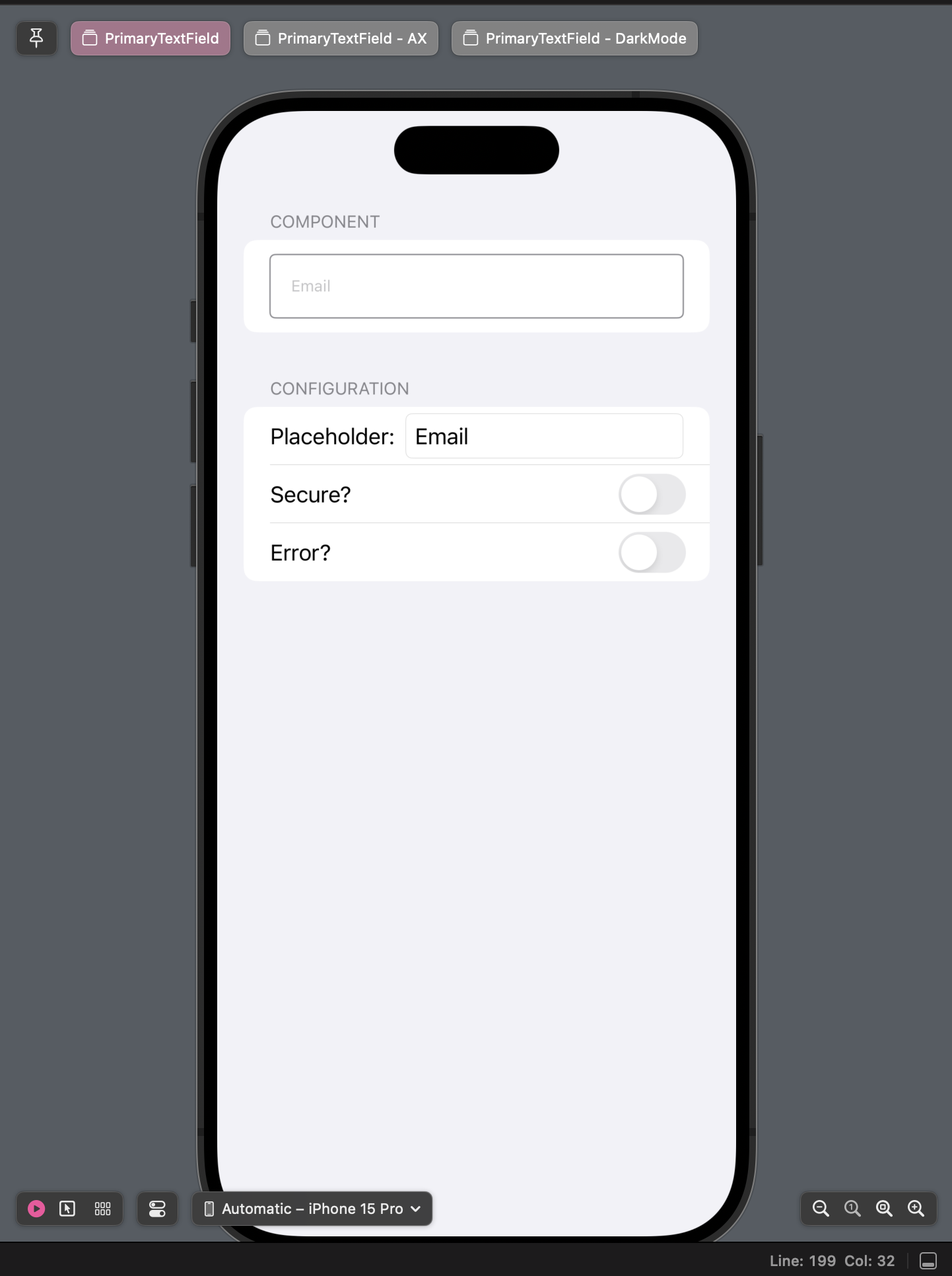
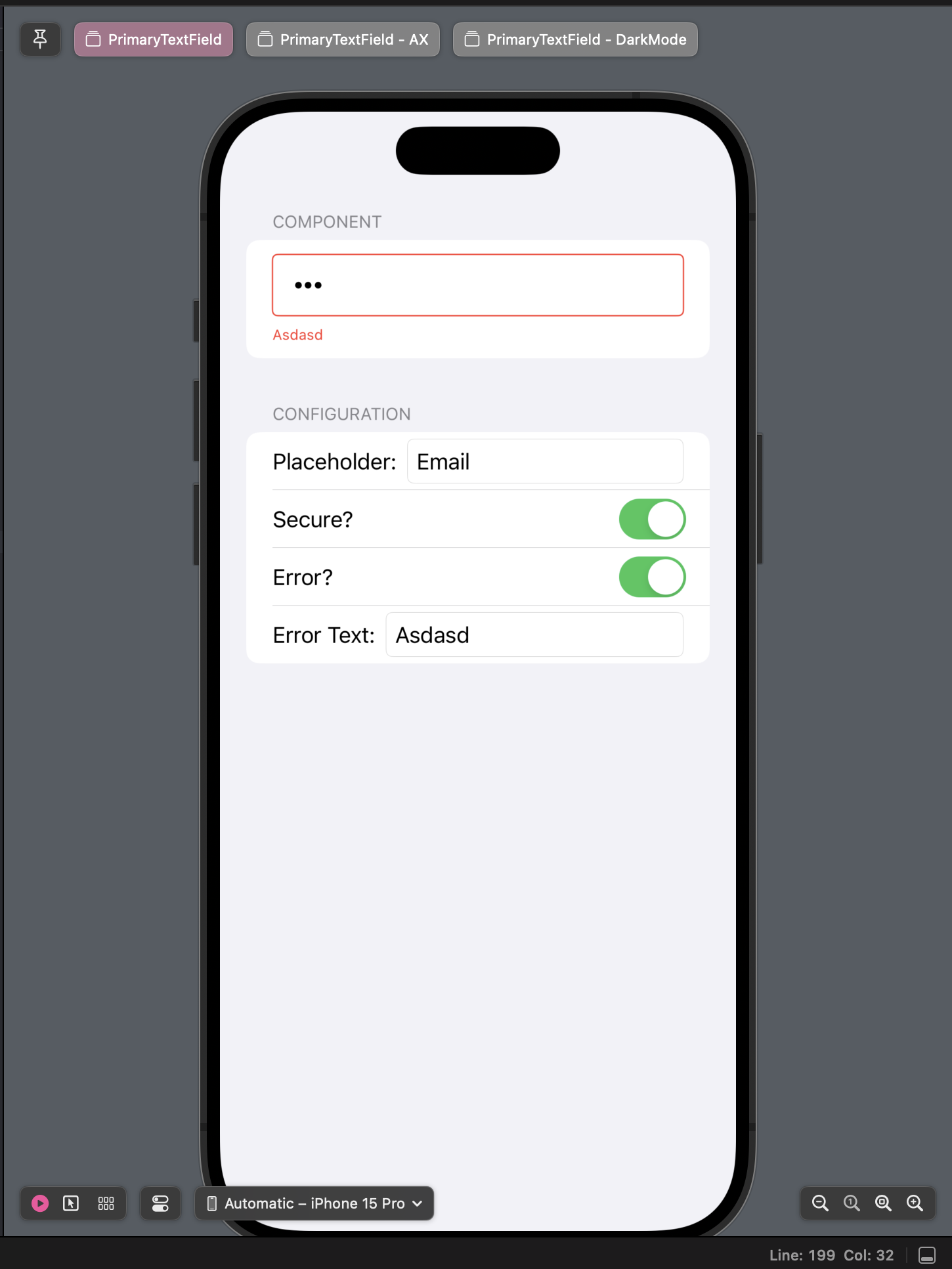
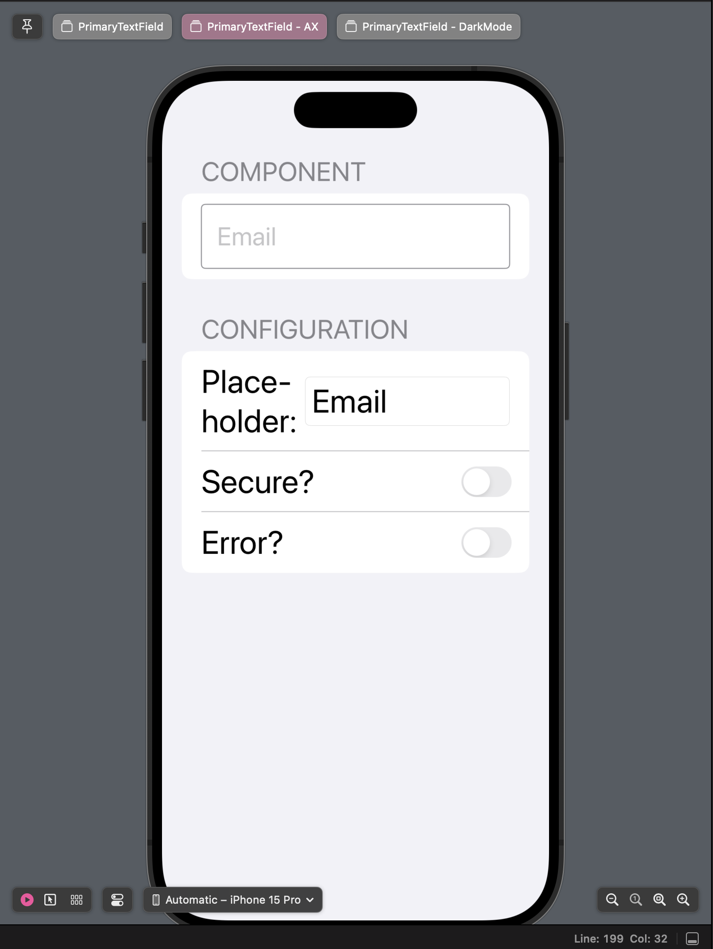
I like using previews as a sort of story-book-like feature. Whenever I create a new component on my Components/CoreUI modules, I create a Previews view. It’s just a simple Form with two sections:
- Component: This is where the real component is displayed.
- Configuration: A set of LabeledContents with customization options for the component (texts, toggles, pickers, etc).
It’s pretty easy to do, and it gives a quick glance at how the component looks and feels.
Furthermore, by creating the Preview as a separate view, it’s pretty easy to check different accessibility options and dark mode.
Table Of Contents:
Example
Grabbing an old component from the Components post:
PreviewView
private struct PrimaryTextFieldContentView: View {
    @State var placeholder: String = "Email"
    @State var text: String = ""
    @State var isSecure: Bool = false
    @State var isDisplayingError: Bool = false
    @State var error: String? = "Error"

    var body: some View {
        Form {
            Section("Component") {
                PrimaryTextField(
                    type: isSecure ? .secure : .default,
                    placeholder,
                    text: $text,
                    error: isDisplayingError ? $error : .constant(nil)
                )
            }

            Section("Configuration") {
                LabeledContent("Placeholder:") {
                    TextField("", text: $placeholder)
                }

                LabeledContent("Secure?") {
                    Toggle("", isOn: $isSecure)
                }

                LabeledContent("Error?") {
                    Toggle("", isOn: $isDisplayingError)
                }

                if isDisplayingError {
                    LabeledContent("Error Text:") {
                        TextField("", text: $error ?? "")
                    }
                }
            }
            .autocorrectionDisabled()
            .textFieldStyle(.roundedBorder)
        }
    }
}
Preview Macros
Then we can create our Preview macros:
#Preview("PrimaryTextField") {
    PrimaryTextFieldContentView()
}

#Preview("PrimaryTextField - AX") {
    PrimaryTextFieldContentView()
        .dynamicTypeSize(.accessibility2)
}

#Preview("PrimaryTextField - DarkMode") {
    PrimaryTextFieldContentView()
        .environment(\.colorScheme, .dark)
}
Result


Next Steps
Assuming you’re building your components in a separate SPM, you could create a new ExampleApp that consumes your module, and let’s you navigate (like a story-book) through your component preview views.
Example: List of Buttons, TextFields, Images, Tokens, Toggles, etc.